01 Overview
One system. Built alone. Adopted across every team.
When I joined Keysight as the lead designer on the Eggplant product, there was no shared design language. Engineering, marketing, the brand team, and product were each making independent visual decisions with no single source of truth. The product was also mid-migration — moving from a legacy Dojo framework into a modern React SaaS platform — which meant inconsistency was actively compounding with every new feature shipped.
I designed and built the Keysight Eggplant Design System from scratch as the sole IC designer. The system covers a full token architecture, a component library of production-ready UI, and usage documentation written to be used directly by engineers. Every decision — from the purple brand scale to the execution dot system unique to Eggplant — was made in collaboration with stakeholders across engineering, marketing, the brand team, and senior leadership.
02 The Problem
Four teams. No shared language.
Eggplant's product surface spans test configuration, scheduling, AI model building, and analytics. Each team had developed their own approach to buttons, form patterns, data tables, and status indicators. The result was a product that looked and behaved differently depending on which surface you were on — and a team spending time on foundational decisions that should have been settled once.
- Engineering rebuilding the same UI components from scratch on every feature
- Marketing using a colour palette that didn't match what was live in the product
- Brand guidelines that had never made it into production
- Leadership seeing inconsistent UI in every internal demo and customer presentation
- No documentation of the interaction patterns specific to Eggplant — like execution dots or schedule pills — that were entirely unique to this product
03 My Role
Lead designer. Sole IC. Full scope.
I was the only designer on this system — owning every part from the initial audit through to Figma library, token architecture, component documentation, and engineering handoff. I also ran all stakeholder alignment sessions, which turned out to be as significant a part of the work as the design itself.
- Conducted a full audit of the live product to document every inconsistent pattern
- Ran alignment workshops with engineering, marketing, the brand team, and leadership to establish a shared visual direction
- Defined the token architecture — colour, spacing, typography, and radius — and got engineering sign-off before building components
- Designed and documented every component in the system, including Eggplant-specific patterns with no equivalent in any other design system
- Wrote all documentation for engineers: CSS token references, HTML code samples, props tables, and usage rules
- Applied the system directly across Runner, Scheduler, Designer, and Insights — the product work and system informed each other throughout
04 The System
Tokens, components, and Eggplant-specific patterns.
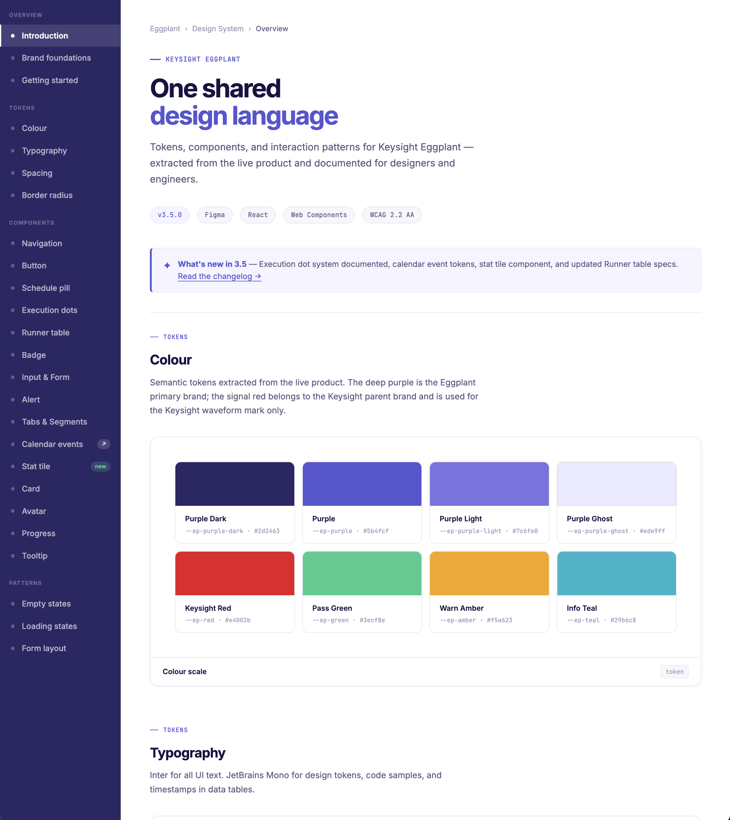
Colour and tokens
The deep purple brand scale is extracted directly from the Eggplant product, with the Keysight parent brand red reserved for the waveform logomark only. All spacing, radius, and type decisions are tokenised — meaning engineers reference variables, not hardcoded values. Future rebrand changes are a single-layer update, not a component-by-component audit.
Components
Every component is documented with a live preview, copy-pasteable code, a props table, and explicit usage guidance. Components range from foundational UI (Button, Input, Badge, Alert) to Eggplant-specific patterns that exist nowhere else.
Eggplant-specific patterns
Two patterns in this system are unique to Keysight Eggplant and required original design work rather than adaptation of existing conventions.
- Execution dots — each dot represents one test run, colour-coded by outcome (pass, fail, warning, info, skipped), with older runs at reduced opacity to convey recency. The dot cluster functions as a mini sparkline — showing historical pass rates at a glance without expanding the row.
- Schedule pills — three distinct states (Daily, Run once, No Schedule) that communicate test configuration recurrence in a single cell. No Schedule renders as a link rather than a pill, giving it interactive affordance without visual weight.
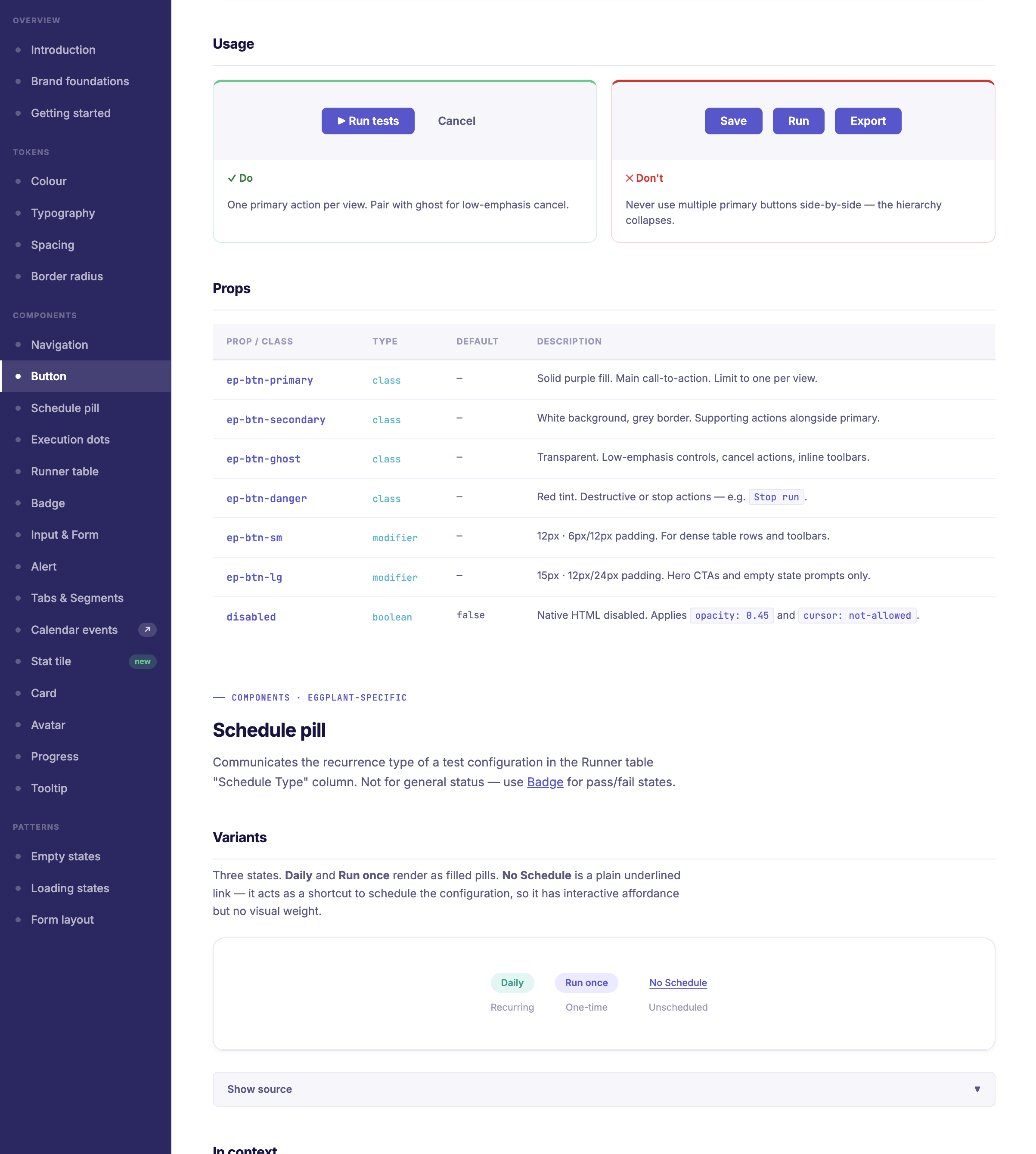
Button component and Schedule pill documentation — props table, usage rules, and live examples
05 The Process
Audit, align, tokens, components, adopt.
The process was not glamorous. The first phase was almost entirely audit and alignment — understanding what existed, who owned what, and what each team actually needed from a system. The design came after that foundation was established.
- Audit first. Catalogued every UI pattern in the live product and mapped it against what engineering had built, what marketing was using, and what the brand guidelines said. Presenting those three things side by side in one document was more persuasive than any proposal. The inconsistency was visible and undeniable.
- Align before building. Four working sessions across four teams. The goal was not consensus on every decision — it was agreement on three things: the design principles, the colour system, and who had final say on what. Getting that clarity early meant the build phase moved without repeated negotiation.
- Tokens before components. Components are straightforward to rebuild. Tokens, once in production, are difficult to change. The token layer was locked and signed off by engineering before any component work began. When components later evolved, the underlying values stayed stable.
- Build against real product needs. Components were shipped as the product needed them rather than completing the full library first. The Runner table was the first major surface requiring the system, so the table, execution dots, and schedule pills were documented first.
- Document for engineers. All documentation was written for the engineering audience: code samples, CSS token references, copy-pasteable HTML, and props tables with type annotations. If an engineer could not use the documentation without asking a question, it was not finished.
06 Impact
What a design system like this actually delivers.
A design system is not a one-time deliverable. It is infrastructure with compounding returns. The first version takes the most time. Each subsequent release takes less, because the foundations are stable and the adoption patterns are established.
- Faster feature delivery. Engineers stopped rebuilding foundational UI on every feature cycle. Designers stopped specifying the same patterns repeatedly. The time recovered goes to harder product problems.
- Consistent user experience. Users who encounter the same pattern in multiple surfaces learn it once. Inconsistent UI creates cognitive friction — users re-learn the same interaction repeatedly, which erodes confidence in the product.
- Scalable brand. Every surface, including marketing and onboarding, now pulls from the same token set. Any future brand evolution is a token-layer change rather than a component-by-component audit across multiple teams.
- Reduced design debt accumulation. Without a system, every shipped feature adds marginally different UI that compounds into a maintenance burden. This system stopped new inconsistency being created — not by fixing what existed, but by giving every team the right components to reach for by default.
1 designer. 4 stakeholder teams aligned. Full token and component system built from zero. Eggplant-specific patterns documented for the first time.