01 Overview
As Founding Product Designer, I built HouseToken from scratch — product strategy, brand identity, design system, end-to-end UX, payments integration, and engineering collaboration, all at once and without a design team. The core tension was a trust problem: real estate is complex, cryptocurrency is culturally polarising, and the combination risks compounding both barriers into a product nobody wants to engage with. The work was about making both feel simple and credible, separately, so users never had to hold them together consciously.
02 The Problem
More than 90% of research participants said understanding potential returns upfront was their primary decision driver before committing to an investment. That single finding anchored everything that followed — information hierarchy, onboarding flow, property listing design, and the language of every CTA in the product.
The core problem was not technology. It was trust, clarity, and perceived risk.
03 My Role
I led the product design from concept to first release, working across strategy, research, branding, interaction design, and developer collaboration.
As an early-stage start-up, I operated across product strategy and hands-on execution.
04 Process
To deeply understand the investment lifecycle, I conducted research beyond the product team. This included visiting established investment firms such as London and Oxford Group to observe how traditional property transactions were structured.
This provided critical insight into how value, risk, and investor confidence are communicated in established markets.
I conducted one-to-one interviews with existing investors, sessions with customer support teams, focus groups exploring attitudes toward digital investment, and competitive benchmarking across fintech and crypto platforms.
Findings were categorised into pain points and prioritised using a 2x2 impact and feasibility matrix to focus on high-value opportunities.
Two major insights shaped the product direction: users needed immediate visibility of potential returns, and the crypto association created hesitation that had to be managed through language and information architecture, not hidden.
The mobile app was scoped to investing and fund management only. Desktop handled deeper trading functionality. This was a deliberate product strategy decision — putting investing and trading in the same context would have forced users to confront the crypto association at the moment they were trying to make a simple investment decision. Separating the surfaces meant the mobile experience could feel like a property investment app, not a crypto exchange.
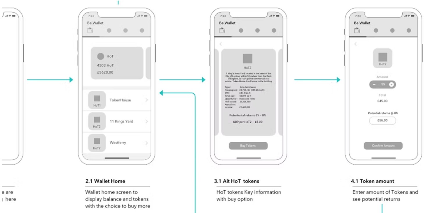
User flows were mapped to ensure clarity across the full journey from onboarding to first investment. During feasibility exploration, payment complexity became a major engineering constraint. After evaluation, we partnered with Stripe to reduce build cost, increase security, and accelerate time to market.
Low-fidelity wireframes were tested to validate early assumptions. Feedback informed navigation restructuring and clearer transactional patterns.
High-fidelity prototypes were developed and tested with real users.
"Show me the money."
The phrase repeated most often across user testing sessions. Verbatim.
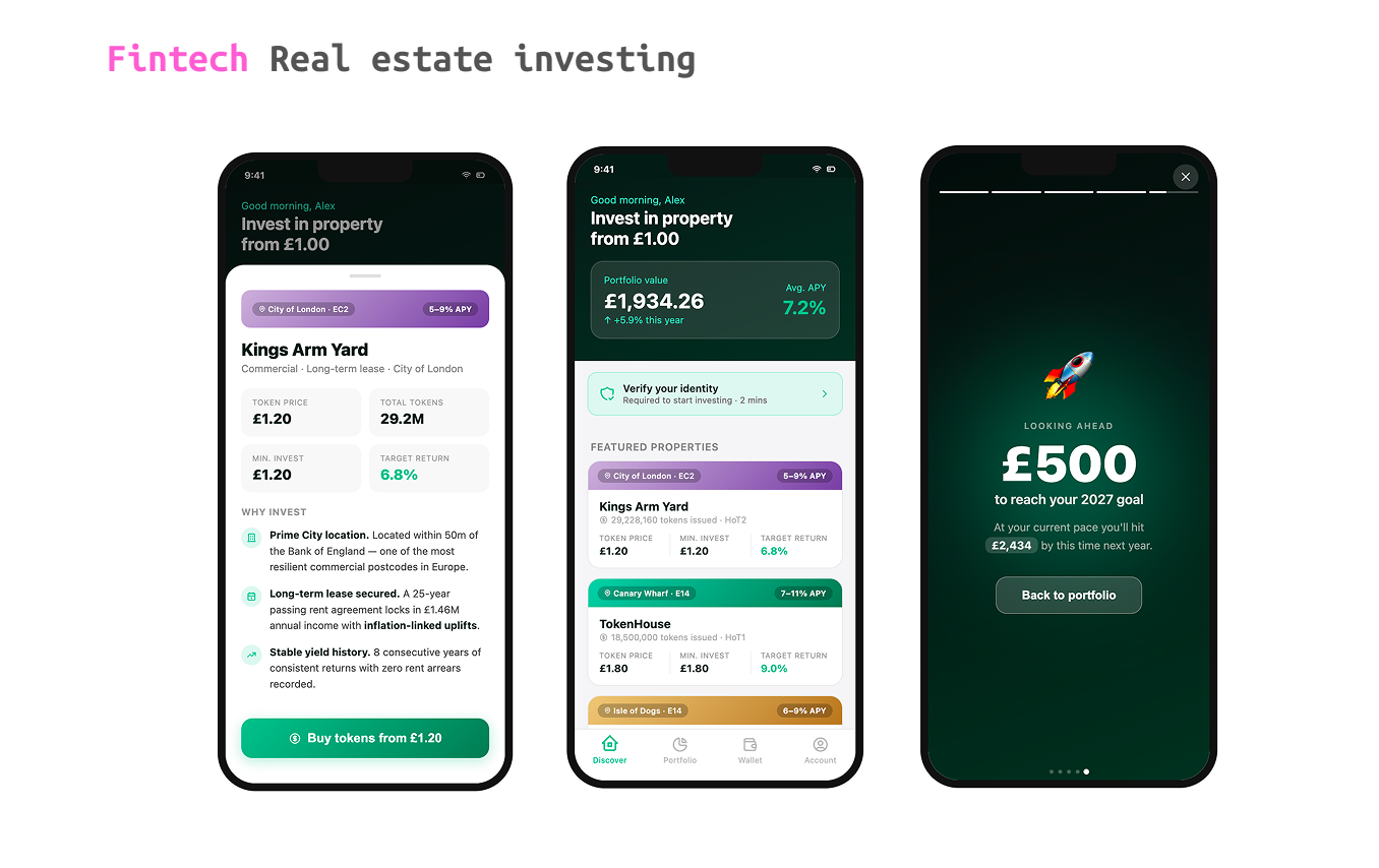
Returns became the primary information hierarchy signal. Every listing led with projected yield before anything else.
The word "blockchain" does not appear in the product UI. Neither does "token" in the investment flow — we used "shares" instead. The decision to remove blockchain terminology was tested explicitly: showing two versions of the same property listing, one using "tokenised shares" and one using "property shares," consistently produced higher comprehension and lower hesitation with the latter. We kept blockchain language in the legal documents and compliance flows where it had to be accurate, but removed it from everywhere a user was making a decision. The technology was the infrastructure, not the product.
The product name and identity were inspired by the historical concept of "Token House," a place where trading tokens could be exchanged for legal tender.
I developed the brand identity, visual language, and early design system foundations, ensuring the product felt credible, modern, and globally relevant. Design assets and specifications were delivered via Zeplin, enabling efficient engineering handoff and consistent pattern implementation.
One of the most deliberate engagement decisions was the animated portfolio dashboard. Rather than presenting static numbers, the desktop experience used motion to surface a user's investment performance — portfolio value, rental income, allocation breakdown — in a sequence that felt like a personalised financial review, not a data table.
The rationale was twofold. First, returning users needed a reason to come back beyond executing transactions. An animated summary that showed real growth and income created a moment of positive reinforcement tied directly to the user's actual investments. Second, personalisation at this level — "Good morning, Alex. Your portfolio is up 5.9% this year" — was the closest the product could get to the feeling of a private banker checking in. It established trust and emotional connection without requiring any user input.
05 Results
The first release established both product-market credibility and improved usability in a highly regulated domain.
1
In prototype testing, task completion on the investment flow improved significantly once returns were surfaced at the top of property listings rather than buried below the fold. Participants who had expressed hesitation in discovery research completed the test investment task without prompting when projected yield was the first thing they saw. HouseToken was an early-stage startup — formal A/B testing and production analytics were not in place at this stage. These findings are from prototype usability sessions.
How measured: prototype usability testing, N=12 participants across two rounds. Production instrumentation was not deployed during this phase.
2
Removing "blockchain" and "token" language from the investment flow — replacing it with "shares" and familiar e-commerce patterns — produced measurable improvement in test task completion. Participants who had flagged crypto hesitation in discovery interviews completed the purchase flow without raising concerns when the blockchain framing was absent. The payment confirmation step, which had been a point of confusion with the original flow, was redesigned with Stripe's standard patterns and produced no drop-off in testing.
How measured: prototype usability testing, same cohort as above. Stripe integration testing confirmed zero payment errors across prototype sessions.
3
The founding team used the product in investor pitches and early sales conversations. Feedback from those sessions was consistent: the product felt more like a fintech investment app than a crypto product, which was the differentiation the founders needed. One early investor noted they had expected to see "another blockchain dashboard" and were surprised by how accessible the onboarding felt. Formal user analytics were not in place pre-launch — these outcomes reflect early-stage stakeholder and investor feedback.
How measured: founder-collected investor and early user feedback. Formal analytics not deployed at this stage.