01 Overview
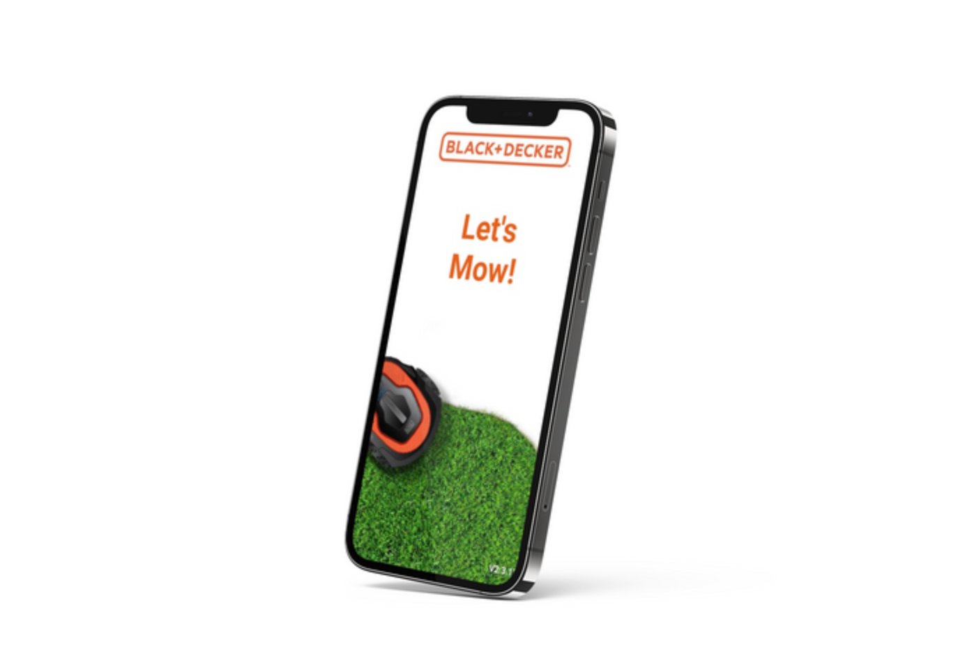
Black & Decker's robotic mower launched with a mobile app designed around system logic rather than user behaviour. The core failure was prioritisation: the actions users needed most — stop, start, status — were buried behind the same UI weight as settings and diagnostics. I led user research and redesign across focus groups in five European markets and multiple languages, with usability testing confirming that immediacy and clarity were universal expectations regardless of market. The redesign put primary controls first and aligned the visual system with the premium hardware it controlled.
02 The Problem
Robotic lawn mowers function similarly to robotic vacuum cleaners, but introduce additional complexity through outdoor installation, boundary setup, and seasonal scheduling.
Research revealed several challenges:
Users expected immediate control and visibility. Instead, they encountered unclear navigation and buried functionality.
Three needs emerged with complete consistency across every market and language tested:
"I want to stop or start my mower instantly from my phone."
"I want to see the mower's status at a glance."
"I want to schedule mowing easily — or mow right now without friction."
Repeated across UK, Germany, France, Netherlands, and Sweden sessions — different languages, same priority order.
The core issue was prioritisation. The interface was built around system features, not user intent.
03 My Role
I led the research, interaction design, and prototype validation for the mobile application, working closely with product teams, engineering, and European market stakeholders.
This project required balancing hardware constraints, internationalisation, and evolving brand standards.
04 Process
As robotic lawn care was a new category for me, I began by developing a deep understanding of the product ecosystem. I led focus groups across multiple European markets to explore user expectations, behaviours, and comparisons with existing robotic vacuum and mower apps.
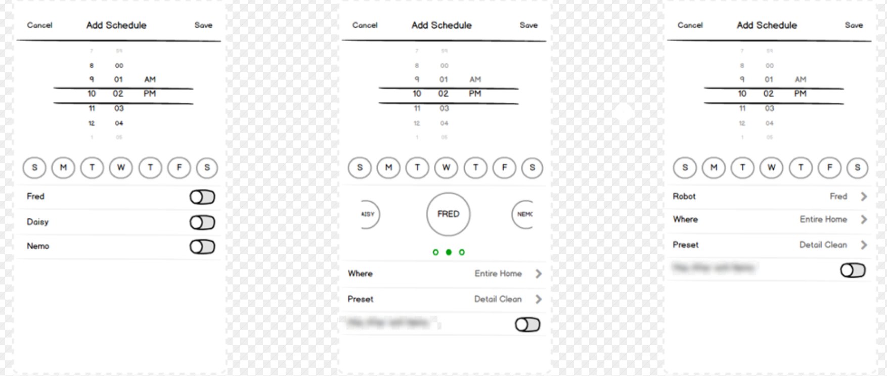
From research, four core functional expectations were identified: a clear hardware status indicator, an accessible activity log, adjustable cutting height, and a weekly mowing schedule.
Wireframes were used not only to visualise solutions but to test prioritisation logic. Multiple flow iterations were reviewed with engineering to validate feasibility and performance constraints.
What surprised me: the priorities were almost entirely consistent across markets. Language differences surfaced in label clarity and scheduling terminology (German participants were significantly more precise about time specifications), but the core hierarchy — control first, status second, scheduling third — held across every session. One specific finding from a German-language session changed the scheduling interface: participants expected to set an end time for mowing, not a duration. "Mow for 2 hours" made no sense to them; "Mow until 14:00" was immediately understood. That change was adopted globally.
Testing across markets confirmed that immediacy and clarity were universal expectations.
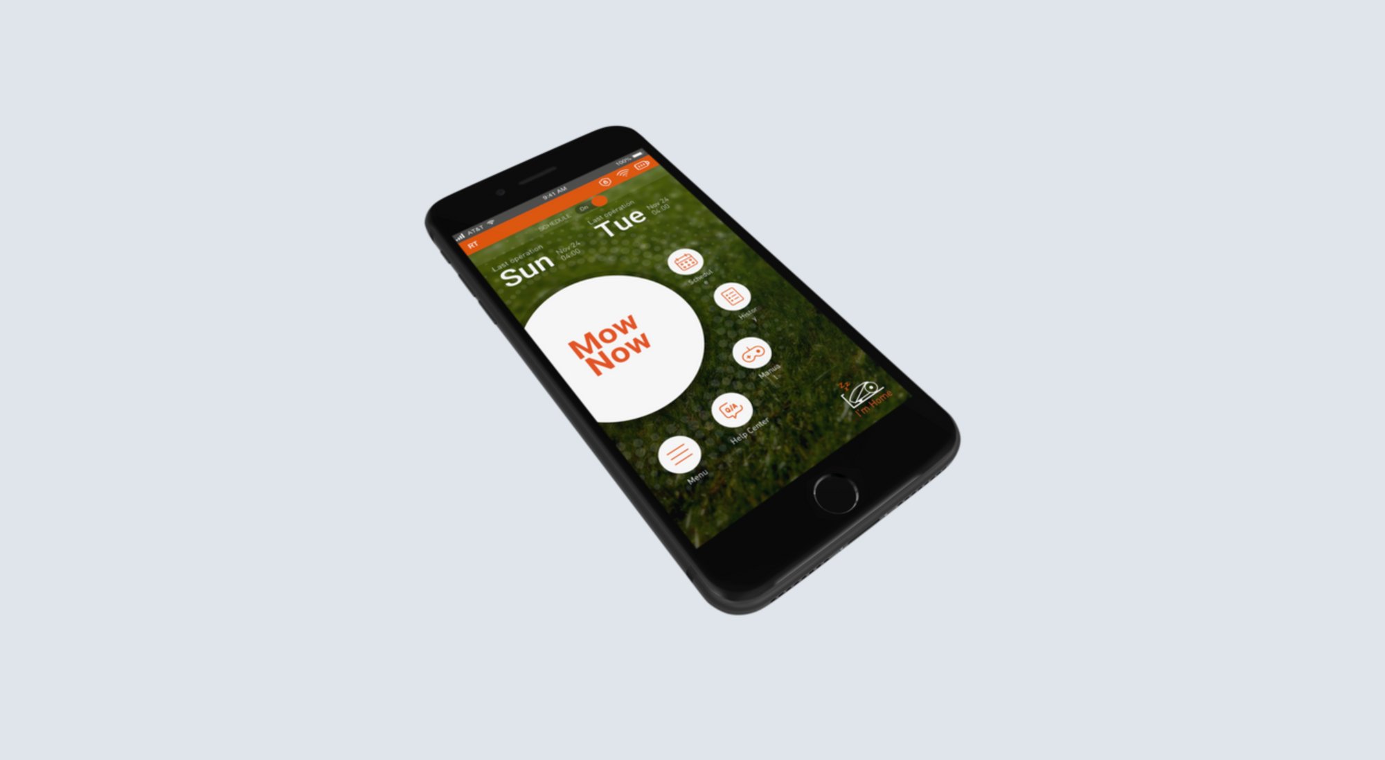
The redesigned experience focused on action-first interaction.
The design direction strengthened brand differentiation while maintaining clarity and functional simplicity.
The original app used a dark utility aesthetic that read more like a security system than a garden product. The brief from the brand team was to align with the new mower's premium positioning, but the real design problem was that the visual language was communicating the wrong emotional register. I moved to a warmer palette with natural material references — the intent was to make the app feel like it belonged outdoors, in daylight, not in a server room. The "Mow Now" button used a sun-ring motif that referenced the product hardware's control dial. These weren't decorative choices — they were intended to reduce the cognitive gap between the physical product and the digital control surface.
05 Results
The redesigned mobile experience improved usability, clarity, and perceived product quality.
1
In usability testing across European market sessions, promoting "Mow Now" and "Stop" to primary controls on the home screen reduced time-to-action for those tasks. First-time scheduling completion improved when duration-based input was replaced with time-based input following the German session finding. These outcomes are from usability testing — the app launched into a category where formal production analytics dashboards were not yet established within the team at the time of delivery.
How measured: task-based usability testing across 5 markets, ~8 participants per market. Production analytics were not instrumented during this phase.
2
The redesigned home screen — showing real-time mower status, battery level, and last activity — consistently reduced the number of help-seeking actions in testing. Participants in the original app frequently tapped multiple screens to confirm the mower was actually doing what they'd asked. With the redesigned status panel, this behaviour disappeared. Users trusted what the screen told them without seeking confirmation elsewhere.
How measured: observed behaviour in usability sessions — help-seeking actions counted per participant per task.
3
Internal stakeholder review confirmed the redesigned app felt consistent with the hardware's premium positioning for the first time. The brand team — who had flagged visual misalignment as a concern before the project started — signed off without revision requests, which was noted as unusual for a first presentation. The warmth in the visual direction was specifically called out as the most significant improvement from the previous version.
How measured: internal stakeholder review feedback; qualitative, not formally scored.
The most useful thing I learned on this project wasn't about mobile design — it was about the limits of assuming research findings transfer across markets. I went in expecting localisation to be a language problem. It turned out to be an interaction model problem. German participants didn't just want different labels — they had a fundamentally different mental model of time-based task management. That required a design change, not a translation. I now treat multi-market research as requiring interaction-level analysis, not just content review.