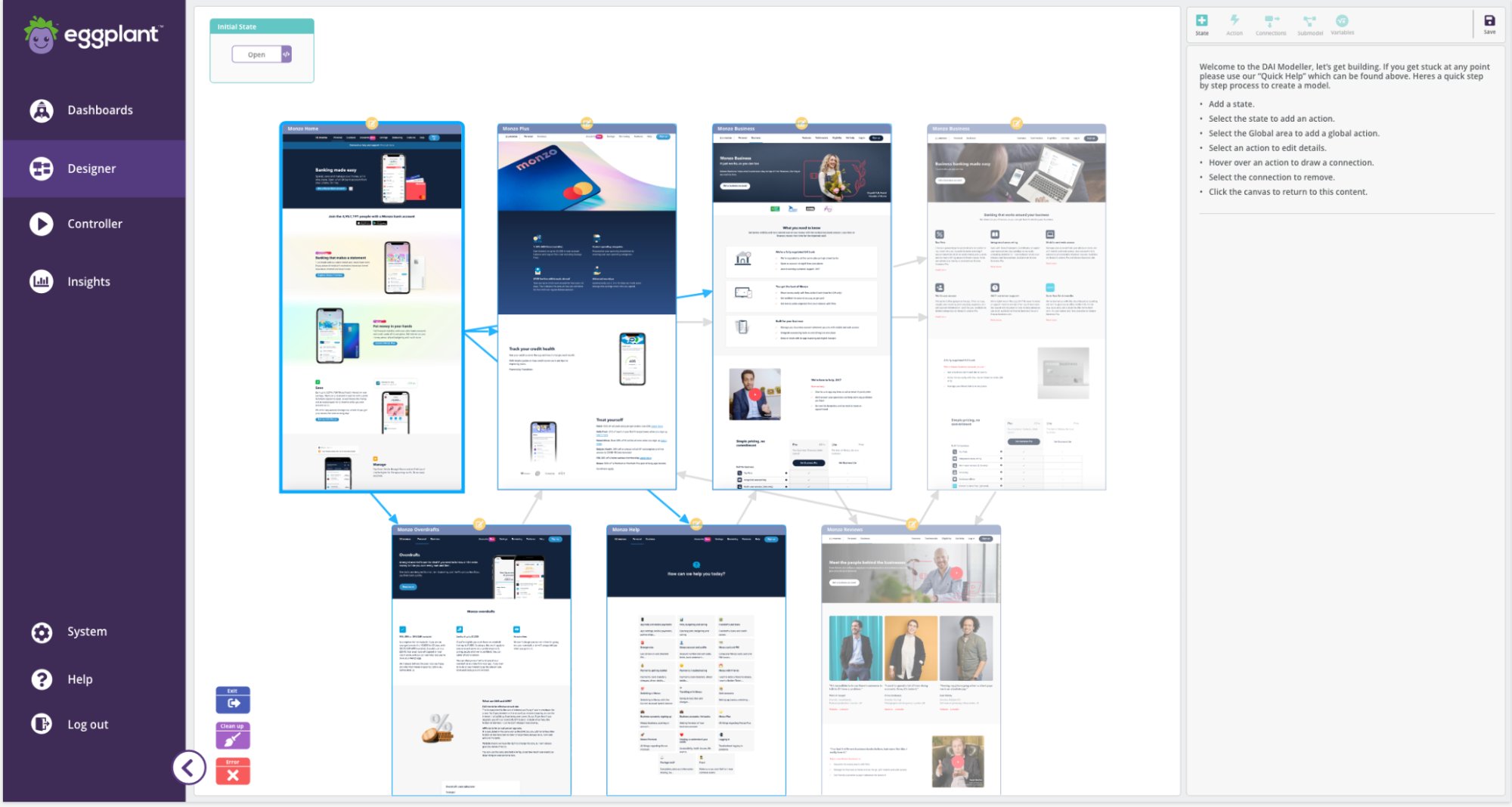
The Eggplant Modeler is how QA teams build AI-powered test models — mapping application states and the actions between them. The tool was built on an outdated Dojo framework outside the newer React SaaS platform, and it used an internal state/action abstraction that didn't match how users think about their applications. Users called states "screens." They opened the application they were testing in a separate window, then switched back to the Modeler to recreate what they'd seen. They were doing the translation manually that the tool should have done for them.
Outcome: 28% reduction in model creation time for first-time users — measured in task-based usability testing with 12 participants, 2 rounds, using a standardised modelling task with no prior Modeler experience.
02 The Problem
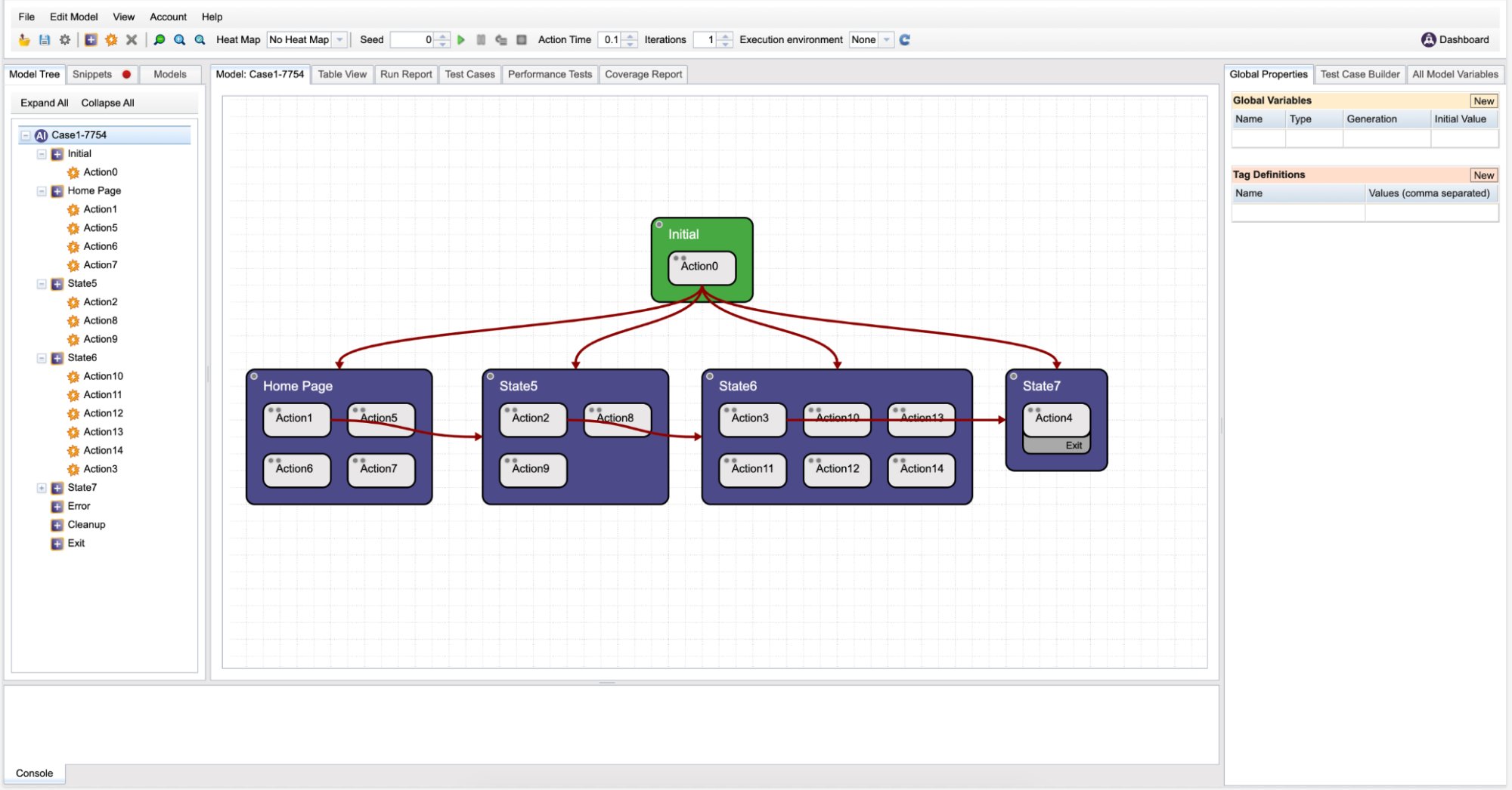
The core problem was a mismatch between the product's internal logic and the user's real-world mental model. The legacy Modeler was built around a State and Action framework that made sense architecturally, but had never been validated against how users actually thought about testing their applications.
Users were not struggling with capability. They were struggling with representation.
Users wanted to see the application they were modelling, not an abstract representation of it.
03 My Role
I led the end-to-end redesign of the Modeler experience, from strategic framing through research, prototyping, and delivery into the new React-based SaaS architecture.
A key constraint: the existing data model (states and actions) could not change. The redesign had to make that model feel invisible to users, not replace it.
04 Process
Before design exploration began, I facilitated stakeholder discussions to align on product vision. The guiding principle became: enable users to easily build a model representation of their application that powers intelligent testing.
However, research showed that users did not want a model representation. They wanted a real representation embedded into the modelling workflow.
I conducted additional qualitative research beyond existing personas to understand behaviour at the task level.
Contextual inquiry: Watching users build models revealed a consistent workaround — opening the application they were testing in a separate window, then switching back to the Modeler to recreate what they'd just seen. Nobody described this as a problem because they'd normalised it. It took observation to surface it as the primary usability failure.
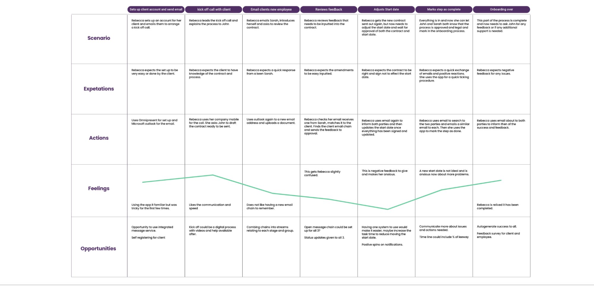
Journey mapping: State creation was the highest-friction moment in the entire flow. Users spent more time naming and configuring states than building connections between them — because the naming step required them to mentally map their application into system terminology without any visual anchor.
Before moving into high-fidelity Figma, I produced a lo-fi user flow diagram to share with stakeholders and engineering. The flow mapped the end-to-end journey through the redesigned Modeler — from first opening the tool, through building a model on top of real application screenshots, to running a pre-flight validation and executing a test. Sharing this at lo-fi fidelity meant the team could challenge the sequence, flag engineering constraints, and align on the core interaction model before any pixel-level decisions were made.
I developed user flows that framed the Modeler as part of the broader testing lifecycle, ensuring engineering feasibility at each stage. Wireframes were tested quickly to validate usability assumptions.
I then built a high-fidelity working prototype and conducted usability testing using Useberry. Heatmaps and session recordings identified friction areas including unclear hierarchy within action properties, lack of state visual confirmation, and need for structured debugging and pre-run validation.
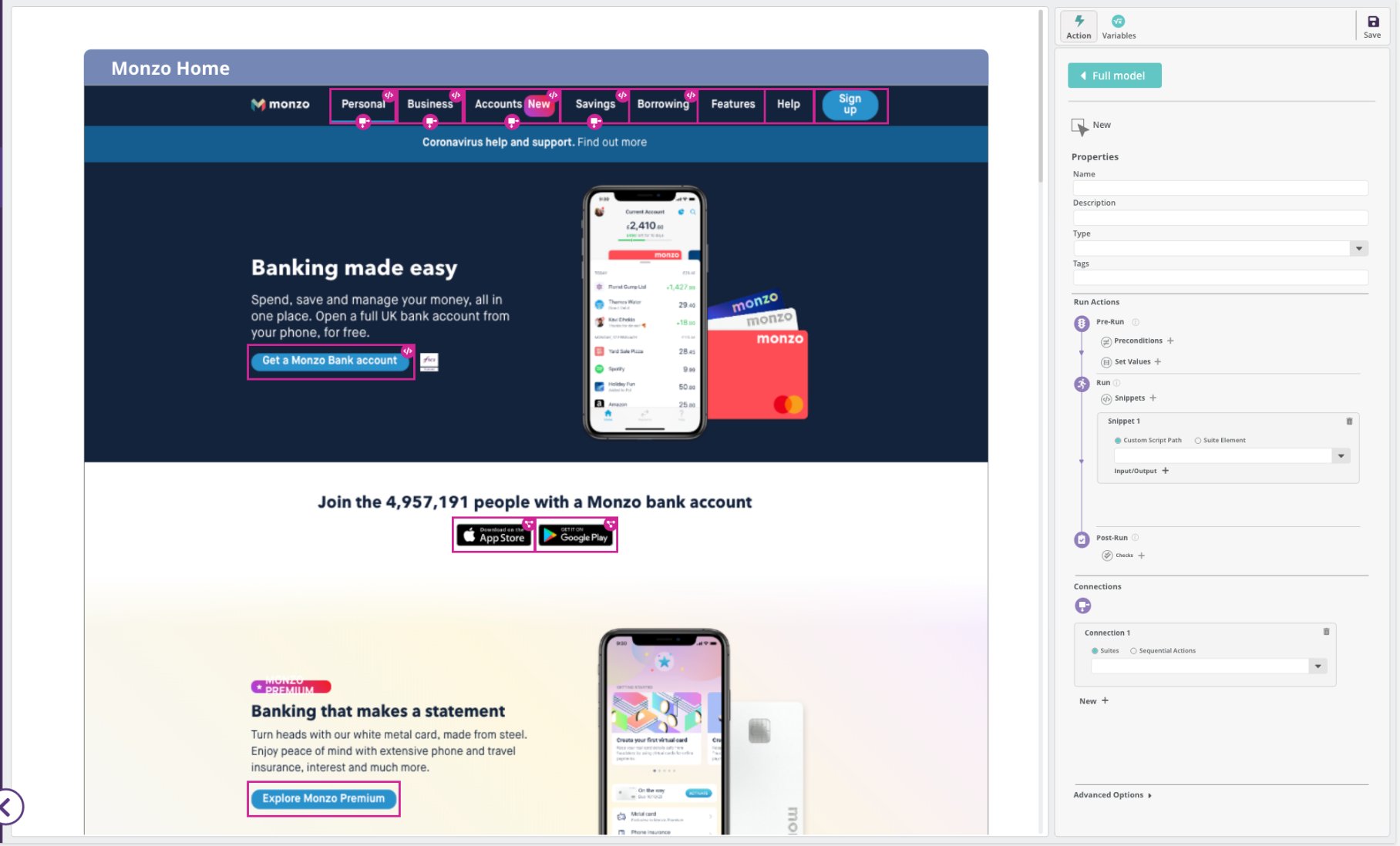
The redesigned Modeler introduced real application image upload to serve as the foundation of model building, direct visual modelling layered on top of application screenshots, a restructured control panel with clear sequencing and hierarchy, and embedded debugging and pre-flight validation cues.
To support scalability and flexibility, I collaborated with engineering to evaluate and adopt Cytoscape as the underlying graph framework, ensuring compatibility with the broader SaaS architecture before committing.
The result was a modernised Modeler service fully integrated into the React platform, grounded in user mental models rather than system abstraction.
05 Results
The redesigned Modeler delivered impact across usability, adoption, and commercial enablement.
1
Embedding real visualisation into the modelling workflow reduced the time required for new users to build their first functional model. 28% reduction in model creation time for first-time users — measured in task-based usability testing with 12 first-time users across two validation rounds. Participants were given a standardised modelling task with no prior Modeler experience. Production analytics were not captured at this stage as the redesign shipped as part of a broader platform migration.
How measured: usability testing, 12 first-time users, 2 rounds. Baseline from same task with the legacy Modeler.
2
Usability testing consistently showed that participants in the redesigned Modeler completed state creation without requesting clarification — a task that generated the highest volume of questions in legacy sessions. Formal support ticket tracking post-launch was not in place at the time, but the customer success team reported a qualitative reduction in model setup questions following the release. This was attributed specifically to the embedded screenshot visualisation removing the need to cross-reference external application windows.
How measured: qualitative observation across usability testing sessions; customer success team retrospective feedback post-launch.
3
The sales team had avoided showing the Modeler in enterprise demos — the abstract interface required too much pre-explanation. After the redesign it became a standard part of the demo flow. One sales lead: "The first version of the tool I'd actually put in front of a prospect without pre-explaining it." Formal win/loss attribution was not tracked.
Source: sales team feedback post-launch, qualitative. No formal instrumentation at this stage.